Calm Meets Color: Understanding the Power of Blue
Today we explore the psychology of blue—how cool tones influence relaxation, focus, and emotional balance. From sky-washed memories to deep-ocean associations, discover research, design tips, and daily practices that harness blue’s quiet strength to support calmer, clearer living.
How Cool Tones Ease the Mind
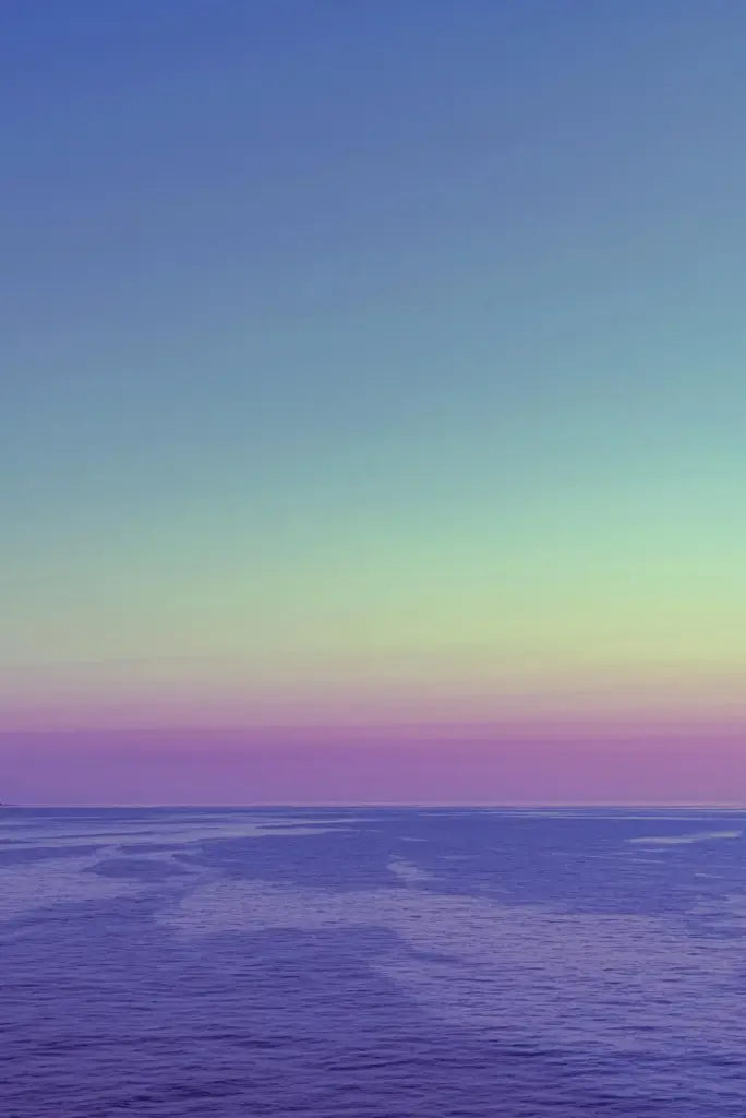
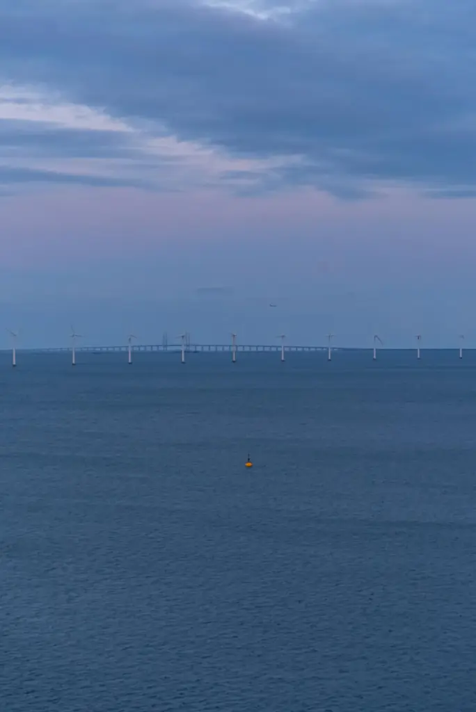
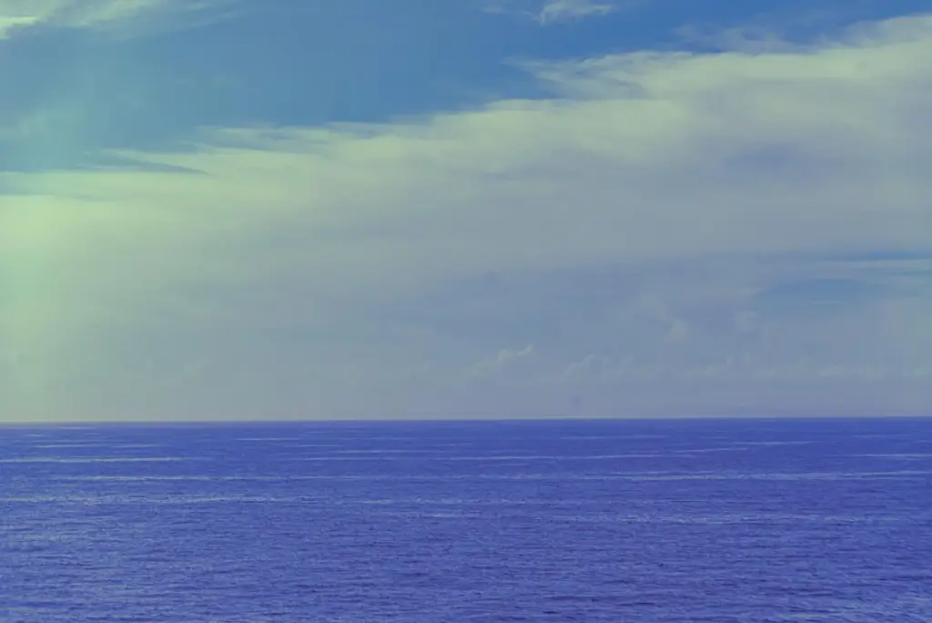
Across studies in psychology and environmental design, cooler hues consistently lower arousal, quiet visual noise, and invite steadier breathing. Blue sits at this gentle center, recalling horizons and water. Here we explore mechanisms, from autonomic regulation to learned associations, and invite you to reflect on moments when blue helped you slow down deliberately.
Wavelengths, light, and the parasympathetic system
Shorter wavelengths within many blue sources subtly influence perception rather than acting like pharmacology. When glare is controlled and intensity moderated, people often report slower heart rate and easier exhalation. Researchers link these shifts to parasympathetic dominance and expectancy effects shaped by experiences with sky, shadowed spaces, and reliable waterscapes.
Memories that anchor calm
From beach mornings to quiet libraries, memories coded with blue surroundings become emotional shortcuts. When similar tones appear, the brain predicts safety and order, reducing vigilance. This prediction loop can soften muscle tension and attention scatter, supporting steadier concentration without demanding strict silence or isolation.
Comparisons with warm palettes
Warm reds and oranges can energize, heighten urgency, and sharpen immediate action. Blue often does the opposite, guiding pacing and recovery. Neither is inherently better; rhythms need contrast. By choosing moments for cool balance, we protect stamina, creativity, and emotional range through intentional color choreography.


Work, Focus, and Digital Interfaces
Cooler palettes can steady cognitive tempo during demanding tasks. Interfaces tinted with gentle blues reduce visual fatigue and perceived clutter, supporting flow without sterile monotony. We’ll examine research, micro-contrast strategies, and accessibility, then invite your feedback on which combinations keep you productive without fraying nerves.
Micro-contrast and readable calm
Instead of bright white on aggressive blue, use softened backgrounds with high-enough contrast ratios that pass guidelines while avoiding glare. Rounded corners and generous spacing reinforce psychological ease. Try our sample palettes, report eye-strain changes after a week, and help refine recommendations for long-haul screen sessions.
Notifications that respect attention
Blue accents can signal importance without panic when paired with calm motion and restrained vibration. Reduce red badges, lengthen fade-ins, and align sounds with softer envelopes. Share which nudges feel respectful yet effective, and we will compile community-vetted defaults for healthier digital rhythms.
Meeting rooms that don’t drain you
Offices painted in muted blues with generous daylight and acoustic softness often improve post-meeting mood. Add live plants for biophilic coherence and a focal artwork in deeper blue to anchor gaze. Tell us how your team’s energy shifted after rebalancing color, light, and seating density.
Sleep, Evening Rituals, and Recovery
As night approaches, cooler visual fields support the mental handbrake. Blue surroundings alone cannot override bright screens, yet they encourage quieter choices. Pair calming hues with dimmed light, cooler showers, and reflective journaling. Share progress markers you notice when wind-down becomes consistent rather than occasional.


Culture, Memory, and Meaning
Blue carries layered stories: trust in uniforms, serenity in paintings, melancholy in lyrics, hope in clear weather. Understanding these meanings clarifies why some tones soothe while others sadden. Share a personal memory involving blue, and read how different cultures shape similar feelings with distinct details.
Practices for Daily Balance
Color only helps when woven into habits. We offer prompts, tiny experiments, and smart defaults that use blue to support attention and rest. Try one idea per day, track feelings with quick notes, and comment with your discoveries so others can borrow what actually works.
The one-minute gaze break
Look at a distant patch of sky or a soft blue object for sixty seconds, expanding peripheral vision and letting shoulders drop. Pair with three slow exhales. Log perceived tension from one to ten, then share whether the number shifted after a week of practice.
Wardrobe choices that tune your day
Choose a navy base when meetings require steadiness, or an airy chambray when creativity needs room. Note how colleagues respond and whether your pacing changes. Post two selfies representing different palettes, and we will discuss the moods they set and what felt sustainable.